5/31/2010

the wonderful work of Sarah Charlesworth

These series by artist Sarah Charlesworth are based on newspaper. By blacking out certain parts of the original lay-out she leaves us with a different sort of "news" (is truth). The reconfigured works are show the essence of a medium and confront us with an aesthetic and editorial bias. It reminds me of the concrete poetry of Paul van Ostaijen, though I think his interest is more in the language itself en in the inherent eclectic beauty of the early newspapers.

Verbs

5/22/2010

I want this

Large image
Ain't this the dearest fox? The  attachment of the legs to the body is like fingers to a hand. And besides that the poor thing is either bashful or slightly ashamed of killing a wee chicken.

4/22/2010

map works

funny maps by Christoph Niemann.
by Christoph Niemann

world street

this is an intersting idea; what would the ideal street look like, if you could pick the best stores, bars, homes etc from all over the world and line them up in a long street? The idea is better than the execution, but google street view could maybe help out here? Since it's now limited to the dull reality of registration, users could maybe compose their ideal world? Combine bits and pieces to create new parks, villages, countries even?


A Splendid Eye


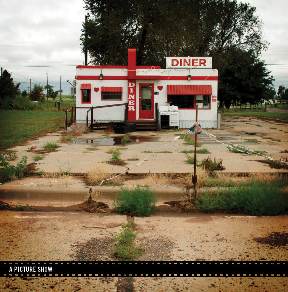
Eric Tabuchi has a splendid eye for the tragic melodramatic, tragi-comic everyday theatre of abandonded objects. Artifacts of human behaviour. Not a single "person" appears in his photo's, but the buildings, objects, debris and trash become characters. really beaytiful work, check it out.

4/21/2010

camera axe trigger

the post made use  used the camera axe.

see article here


drop capturing

the beauty of drops photographed with the use of technology. here's a set up instruction


Massimo Vignelli's Bicentennial Poster

What a fantastic Typgraphic design.


i want this!

Unfolded designed this really cool Tea Pot. I am not much for Tea, coffee is more my drink when it comes to hot beverages. Still, I wouldn't mind having this polygone tea pot. It was based on the first complex 3d model:
The Utah teapot is a 3D model created in 1975 by Martin Newell which has become a standard reference object in the computer graphics community. It is a simple, round, partially concave mathematical model of an ordinary teapot. The objective of Utanalog by Unfold is to return the iconographic teapot to its roots as a piece of functional dish-ware while showing its status as an icon of the digital world.
On the website they state it's for sale and has been actually produced. I sent a mail about the price, though I am afraid it will be quite expensive.
buttonUtanalog

2/08/2010

Polaroids by Anna Verlet

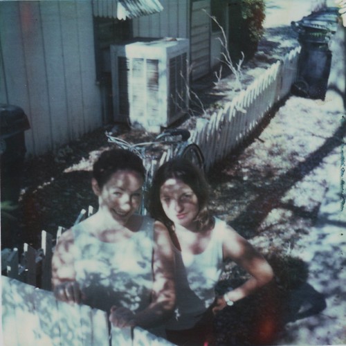
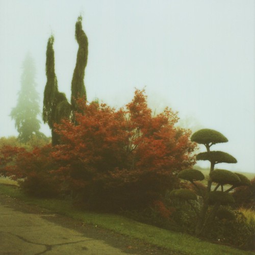
Beautiful polaroids by Anna Verlet, who has great eyes. These are two of my favourites, though there's many other.

2/07/2010

Norwich Textile Pattern Book

On of those typical cases of serendipity. I was searching for graphic patterns of South American Tapestry and came across what must be one of the most astonishing book"works" that have ever been made. It is a pattern book from the 18th century and it is filled with sample strips of fabric. It must weigh a ton. I own the giant Book of Ornaments Taschen republished and that's amazing in it's printed form. This is the real deal, tactile, handmade...


dscf4190.jpg
19666611detail-2.jpg
patterncard1.jpg

2/05/2010

wrangler interactive cinematic catalogue

this is one excellently made website for wrangler jeans. the interaction is just soo smooth and cinematic. it also loads like a fucker, so that really good work in the compression department. the overall impact of the movieclips, the use of sound/music and the graphic handling of typography and buttons makes for a really immersive user experience. There's also the advantage of being able to see the jeans and shirts from different angle, so the stuntman like behaviour - or is it judo? - of the character is still functional in some odd way.
if in the end this experience will result to me buying wrangler jeans is another issue. Don't think so. There seems to be real trend to pimping the way products are presented.

11/11/2009

Stephen Wiltshire drawing from memory

from designboom


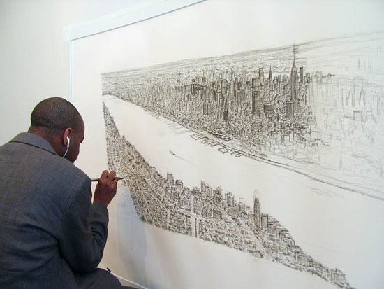
Here you can follow the live creation of a drawing of the Manhattan Skyline by memory by british artist Stephen Wiltshire. Stephen Wiltshire is an artist who draws and paints detailed cityscapes. He has a particular talent for drawing lifelike, accurate representations of cities, sometimes after having only observed them briefly.
I don't really like the drawings stylewise, but it fascinates me that people with a photographic memory only need a brief view of a scene to render it accurately. Like having a build-in camera. Of course you need a double competence; one for memorizing and one for reproducing the memorized. It is the quality of this conversion which makes us call it art.. or not.

10/29/2009

Mc Sweeney en de toekomst van de onderzoeksjournalistiek

Onderstaand mailtje is afkomstig van Mc Sweeney's. Het geesteskind van wonderkind Dave Eggers; auteur en uitgever.
Mc Sweeney's publiceert naast Mc Sweeney's quarterly concern; het mooist uitgegeven boek/blad ooit (nou ja..), ook mijn lijfblad The Believer het leukste en breedste literaire maandblad dat ik ken, de vierjaarlijks film/documentaire periodiek Wolphin en uitgeverij. Allen zeer aan te raden en voor ons Hollanders belachelijk goedkoop door de lage stand van de dollar en de relatief hoge oplages (the Believer heeft een oplage van 15.000 en toch geen adverteerders!).
U hoort het ik ben fan. Ik vind dat dit een groep mensen is die er toe doen, die hun nek uitsteken, die iniatieven ontplooien, die kosten nog moeite sprane, die de wereld niet mooier maar wel inzichtelijker willen maken en die staan voor alles waar Amerikanen echt trots op mogen zijn. Amen.

De mail die ik kreeg is een verzoek. Een verzoek in eerste gericht aan lezers en betrokkenen uit Amerika, of zelfs San Fransisco. Niet het eerste verzoek wat ik kreeg. Het beroemde blad the Nation is ook al maanden aan het bedelen voor voortbestaan en bestaat inmiddels bij gratie van giften en donaties. Eigen schuld "printed media"? Of is er iets anders aan de hand? En is het eigen schuld onafhankelijke media? Allemaal vragen die nu niet aan de orde moeten komen maar die wel ten grondslag liggen aan deze e-mails.

Dit verzoek, deze mail, kan worden uitgelegd als het zoeken naar nieuwe vormen van journalistiek en de financiering daarvan maar ook als een wanhoopsoproep om private financiering van de en als een slecht teken met betrekking tot de stand van hoe onderzoeksjournalistiek A.D. 2009 gefinancierd wordt (en misschien ook wel moèt worden; for the people, by the people). Een interessant staaltje moderne fondsenwerving voor een gigantische journalistiek project (een 96 pagina's artikel! Dat is in Nederland zeker nog nooit vertoond). Er klinkt (over)moed maar ook lichte paniek
Mocht iemand nog twijfelen over aanschaf van het bewuste nummer dan wel steun aan dit project; verder in het nummer medewerking van de drie allergrootste graphic novellists/striptekenaars en stukken van enkele van de beste fictie en non fictieschrijvers die er op dit moment zijn (I.M.H.O.).
Mijn doel is overigens niet om geld, dan wel abonnees te werven, hoewel het me goed lijkt als dat zo is. Ik ben slechts geboeid door deze ogenschijnlijk geïsoleerde oproep – een Amerikaans tijdschrift vraagt geld voor een zeer diepgravend onderzoek naar een brug in San Fransisco – en vraag me af of dit een blijvende ontwikkeling binnen de (kritische) journalistiek is. Er lijkt op zijn minst al sinds enkele jaren sprake van een professionalisering van de zogenaamde grassroots bewegingen. Eenzelfde professionalisering die deels heeft geleid tot Obama's verkiezingszege (een interessant artikel daarover trouwens in voorgenoemde Believer). Ook lijkt het te duiden op een definitieve verschuiving van de verhoudingen in de relatie tussen opdrachtgever/uitgever/journalist/publiek. In die zin heeft deze ontwikkeling ook grote gevolgen voor ons medialandschap. ik zie in Nederland bijvoorbeeld parallellen met de ledenwerfactie en het succes van GeenStijl. Ander doel, andere organisatie, ander land en mediastelsel, maar wel eveneens een rigoreuze Call to Arms buiten het bestaande journalistieke stelsel om.


M c S W E E N E Y ' S  


---------
If you live in the Bay Area, as we do, you may have noticed that Tuesday night a five-thousand-pound piece of steel fell off the top of the Bay Bridge and onto a small truck. Now the bridge (the whole bridge! Used by 280,000 drivers a day!) is closed indefinitely, the six-week-old emergency repair that put that piece of steel there has been called into question—and the twelve-year-old, $4.5-billion-over-budget Bay Bridge earthquake retrofit is looking more ill-conceived by the minute. What on earth is going on?

It seems like as good a time as any to announce that our next issue will feature a genuinely groundbreaking report, written by two-time Pulitzer Prize-winner Bob Porterfield and structural-engineer-turned-reporter Patricia Decker, on just what has brought our dear bridge to where it is today. Our correspondents, with the help of San Francisco's Public Press, have been digging into this for months, following the money through Chinese steel refineries and Sacramento bureaucracies, and what they've found will recast the way Tuesday's bridge-breaking and the last decade of bridge-mending is understood. It's an incredible story, and we're going to shed more light on it than any investigation to date.

You'll be able to read the whole thing in Issue 33, but you can also, right now, help Porterfield and Decker secure the resources they still need—we're funding their investigation through Spot.Us, and we're hoping that the next few weeks will see their budget goal reached. It's a new approach for us, but the prospect of reader support is what's making this piece possible.

And, if you are wondering why we're running long-form investigative infrastructure reporting in our literary quarterly—it is because Issue 33 of McSweeney's is a one-time-only, Sunday-edition-sized newspaper. We are calling it the San Francisco Panorama, and it may well be the biggest project we have ever undertaken: there is, besides a ninety-six page broadsheet dedicated to the news of the day and of the Bay,

• a sixteen-page, full-color, 15" x 22" comics section with work from Dan Clowes, Chris Ware, and Art Spiegelman;
• extraordinary reportage from William T. Vollmann and Nicholson Baker;
• a 100+ page magazine featuring essays from Antarctica and Israel and Andrew Sean Greer at a NASCAR race;
• a 100+ page book review with new fiction by George Saunders and Roddy Doyle, James Franco interviewing Miranda July, and Joshuah Bearman on romance-novel cover models;
• China Miéville reviewing The Road and Stephen King watching the world series;
• and also possibly, seriously, the best food section that has ever appeared in any newspaper anywhere, with an incredible modular ramen recipe from New York's own David Chang and a fifty-eight-step lamb-belly photo essay from San Francisco's Ryan Farr.

We have been working nonstop on this one since the spring, and we couldn't be more excited about every ounce of it—but as ever, this thing depends on the commitment of our readers, so if any of this sounds like something you'd like to see on your doorstep, sign up for it today. And if you are a store, any kind of store, or even a museum or something like that, and you are interested in carrying our paper in the Bay Area or anywhere else—well, email adam@mcsweeneys.net and he will sell it to you!

Meanwhile: we'll be putting up glimpses of the issue on our site until it's out, so please do check back there as well. There's all kinds of exciting stuff to come.