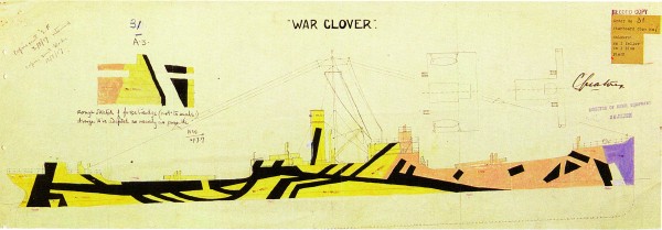
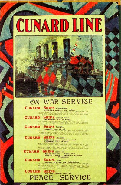
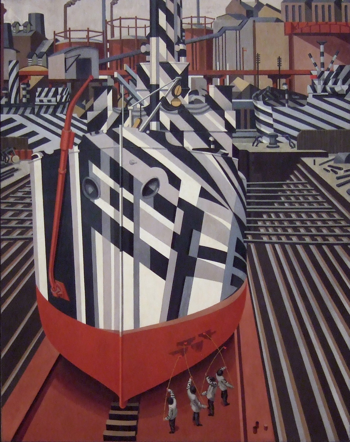
11/11/2009

Stephen Wiltshire drawing from memory

from designboom


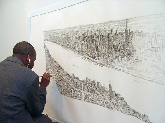
Here you can follow the live creation of a drawing of the Manhattan Skyline by memory by british artist Stephen Wiltshire. Stephen Wiltshire is an artist who draws and paints detailed cityscapes. He has a particular talent for drawing lifelike, accurate representations of cities, sometimes after having only observed them briefly.
I don't really like the drawings stylewise, but it fascinates me that people with a photographic memory only need a brief view of a scene to render it accurately. Like having a build-in camera. Of course you need a double competence; one for memorizing and one for reproducing the memorized. It is the quality of this conversion which makes us call it art.. or not.

10/29/2009

Mc Sweeney en de toekomst van de onderzoeksjournalistiek

Onderstaand mailtje is afkomstig van Mc Sweeney's. Het geesteskind van wonderkind Dave Eggers; auteur en uitgever.
Mc Sweeney's publiceert naast Mc Sweeney's quarterly concern; het mooist uitgegeven boek/blad ooit (nou ja..), ook mijn lijfblad The Believer het leukste en breedste literaire maandblad dat ik ken, de vierjaarlijks film/documentaire periodiek Wolphin en uitgeverij. Allen zeer aan te raden en voor ons Hollanders belachelijk goedkoop door de lage stand van de dollar en de relatief hoge oplages (the Believer heeft een oplage van 15.000 en toch geen adverteerders!).
U hoort het ik ben fan. Ik vind dat dit een groep mensen is die er toe doen, die hun nek uitsteken, die iniatieven ontplooien, die kosten nog moeite sprane, die de wereld niet mooier maar wel inzichtelijker willen maken en die staan voor alles waar Amerikanen echt trots op mogen zijn. Amen.

De mail die ik kreeg is een verzoek. Een verzoek in eerste gericht aan lezers en betrokkenen uit Amerika, of zelfs San Fransisco. Niet het eerste verzoek wat ik kreeg. Het beroemde blad the Nation is ook al maanden aan het bedelen voor voortbestaan en bestaat inmiddels bij gratie van giften en donaties. Eigen schuld "printed media"? Of is er iets anders aan de hand? En is het eigen schuld onafhankelijke media? Allemaal vragen die nu niet aan de orde moeten komen maar die wel ten grondslag liggen aan deze e-mails.

Dit verzoek, deze mail, kan worden uitgelegd als het zoeken naar nieuwe vormen van journalistiek en de financiering daarvan maar ook als een wanhoopsoproep om private financiering van de en als een slecht teken met betrekking tot de stand van hoe onderzoeksjournalistiek A.D. 2009 gefinancierd wordt (en misschien ook wel moèt worden; for the people, by the people). Een interessant staaltje moderne fondsenwerving voor een gigantische journalistiek project (een 96 pagina's artikel! Dat is in Nederland zeker nog nooit vertoond). Er klinkt (over)moed maar ook lichte paniek
Mocht iemand nog twijfelen over aanschaf van het bewuste nummer dan wel steun aan dit project; verder in het nummer medewerking van de drie allergrootste graphic novellists/striptekenaars en stukken van enkele van de beste fictie en non fictieschrijvers die er op dit moment zijn (I.M.H.O.).
Mijn doel is overigens niet om geld, dan wel abonnees te werven, hoewel het me goed lijkt als dat zo is. Ik ben slechts geboeid door deze ogenschijnlijk geïsoleerde oproep – een Amerikaans tijdschrift vraagt geld voor een zeer diepgravend onderzoek naar een brug in San Fransisco – en vraag me af of dit een blijvende ontwikkeling binnen de (kritische) journalistiek is. Er lijkt op zijn minst al sinds enkele jaren sprake van een professionalisering van de zogenaamde grassroots bewegingen. Eenzelfde professionalisering die deels heeft geleid tot Obama's verkiezingszege (een interessant artikel daarover trouwens in voorgenoemde Believer). Ook lijkt het te duiden op een definitieve verschuiving van de verhoudingen in de relatie tussen opdrachtgever/uitgever/journalist/publiek. In die zin heeft deze ontwikkeling ook grote gevolgen voor ons medialandschap. ik zie in Nederland bijvoorbeeld parallellen met de ledenwerfactie en het succes van GeenStijl. Ander doel, andere organisatie, ander land en mediastelsel, maar wel eveneens een rigoreuze Call to Arms buiten het bestaande journalistieke stelsel om.


M c S W E E N E Y ' S  


---------
If you live in the Bay Area, as we do, you may have noticed that Tuesday night a five-thousand-pound piece of steel fell off the top of the Bay Bridge and onto a small truck. Now the bridge (the whole bridge! Used by 280,000 drivers a day!) is closed indefinitely, the six-week-old emergency repair that put that piece of steel there has been called into question—and the twelve-year-old, $4.5-billion-over-budget Bay Bridge earthquake retrofit is looking more ill-conceived by the minute. What on earth is going on?

It seems like as good a time as any to announce that our next issue will feature a genuinely groundbreaking report, written by two-time Pulitzer Prize-winner Bob Porterfield and structural-engineer-turned-reporter Patricia Decker, on just what has brought our dear bridge to where it is today. Our correspondents, with the help of San Francisco's Public Press, have been digging into this for months, following the money through Chinese steel refineries and Sacramento bureaucracies, and what they've found will recast the way Tuesday's bridge-breaking and the last decade of bridge-mending is understood. It's an incredible story, and we're going to shed more light on it than any investigation to date.

You'll be able to read the whole thing in Issue 33, but you can also, right now, help Porterfield and Decker secure the resources they still need—we're funding their investigation through Spot.Us, and we're hoping that the next few weeks will see their budget goal reached. It's a new approach for us, but the prospect of reader support is what's making this piece possible.

And, if you are wondering why we're running long-form investigative infrastructure reporting in our literary quarterly—it is because Issue 33 of McSweeney's is a one-time-only, Sunday-edition-sized newspaper. We are calling it the San Francisco Panorama, and it may well be the biggest project we have ever undertaken: there is, besides a ninety-six page broadsheet dedicated to the news of the day and of the Bay,

• a sixteen-page, full-color, 15" x 22" comics section with work from Dan Clowes, Chris Ware, and Art Spiegelman;
• extraordinary reportage from William T. Vollmann and Nicholson Baker;
• a 100+ page magazine featuring essays from Antarctica and Israel and Andrew Sean Greer at a NASCAR race;
• a 100+ page book review with new fiction by George Saunders and Roddy Doyle, James Franco interviewing Miranda July, and Joshuah Bearman on romance-novel cover models;
• China Miéville reviewing The Road and Stephen King watching the world series;
• and also possibly, seriously, the best food section that has ever appeared in any newspaper anywhere, with an incredible modular ramen recipe from New York's own David Chang and a fifty-eight-step lamb-belly photo essay from San Francisco's Ryan Farr.

We have been working nonstop on this one since the spring, and we couldn't be more excited about every ounce of it—but as ever, this thing depends on the commitment of our readers, so if any of this sounds like something you'd like to see on your doorstep, sign up for it today. And if you are a store, any kind of store, or even a museum or something like that, and you are interested in carrying our paper in the Bay Area or anywhere else—well, email adam@mcsweeneys.net and he will sell it to you!

Meanwhile: we'll be putting up glimpses of the issue on our site until it's out, so please do check back there as well. There's all kinds of exciting stuff to come.


10/26/2009

interactive typeface

This is a nice typeface called 'laika' by michael fluckiger and nicolas kunz. It reacts to various circumstances.

LAIKA from Michael Flückiger on Vimeo.


site here.

10/25/2009

Tree/map

When looking at the thumbnail I thought this was the reflection of a tree in a pool of water. It is a map of Kentucky though. Could be a useful mix up one day.
 

9/24/2009

victorian tradecards

A site completely devoted to the Victorian age. Tradecards of every possible make and category are on display!


8/17/2009

camouflage 3

here is more on the art of dazzle camouflage, razzle dazzle, or dazzle painting
The primary object of this scheme was not so much to cause the enemy to miss his shot when actually in firing position, but to mislead him, when the ship was first sighted, as to the correct position to take up. [Dazzle was a] method to produce an effect by paint in such a way that all accepted forms of a ship are broken up by masses of strongly contrasted colour, consequently making it a matter of difficulty for a submarine to decide on the exact course of the vessel to be attacked.... The colours mostly in use were black, white, blue and green.... When making a design for a vessel, vertical lines were largely avoided. Sloping lines, curves and stripes are by far the best and give greater distortion.
here is an interesting article about the relationship between artists and the war industry in a review of an exhibition called artists and camouflage.
here is good article as well.
Click here to return to the story.

Click here to return to the story.

The Bible in the US woodland camouflage pattern, first introduced in 1989.


camouflage 2

Apparently Jeff Koons designed the exterior of the yacht Guilty, owned by billionaire Dakis Joannou. His design is inspired by the camouflage mentioned in the first post, and by, I think, lego and obviously Roy Liechtenstein.
By the way the designer of the boats camouflage in the post of yesterday is called Maurice Freedman, He was, and I quote,  the district camoufleur for the 4th district of the U.S. Shipping Board, Emergency Fleet Corporation. The plans shown are not for war vessels but for merchant ships.
Dakis Joannou's jeff koons yacht

8/16/2009

camouflage

I found this article about the camouflage of war vessels around WWI. I came across the painting "dazzle ships in drydock in Liverpool" by Edward Wadsworth.
File:Dazzle-ships in Drydock at Liverpool.jpg

the great site but does it float has an article about camouflage, and it links to a nice site of the RISD with tens of sketches of the graphically stunning designs for the war vessels which can be found here.

3/02/2009

fifties illustration techniques

I have been searching the web for what seems like forever to find something meaningful on the techniques of fifties storybook style illustration. I finally found a true treasure island of insight techniques, expert explanations and excellent examples: John K's Blog. Blessed be the good man.
He posted an interview with one of comic's greatest artists; Art Lozzi. This interview covers about the whole subject of illustration techniques and it sure answered a lot of maddening questions i had about how to obtain certain effects (like the grainy shading that is so typical of the "Golden Book" style. (Partly this involves acrylics, rollers and sponges)
Thanks John, and Thanks Art!
The interview is here (scroll down a bit)