3/17/2009


3/02/2009
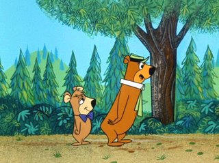
fifties illustration techniques
I have been searching the web for what seems like forever to find something meaningful on the techniques of fifties storybook style illustration. I finally found a true treasure island of insight techniques, expert explanations and excellent examples: John K's Blog. Blessed be the good man.
He posted an interview with one of comic's greatest artists; Art Lozzi. This interview covers about the whole subject of illustration techniques and it sure answered a lot of maddening questions i had about how to obtain certain effects (like the grainy shading that is so typical of the "Golden Book" style. (Partly this involves acrylics, rollers and sponges)
Thanks John, and Thanks Art!
The interview is here (scroll down a bit)

12/18/2008
nice animation
beautifully animated short film. Course and sweet. Charlie Harper meets tatsuro kiuchi, or something like that!
Thanks José!
Thanks José!
12/07/2008
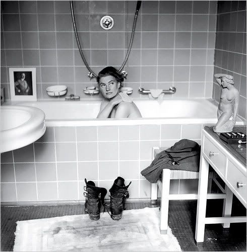
Lee Miller in Adolf Hitler's bathtub
I saw this image in an episode of Roel van broekhoven en Geert Maks's "In Europ (an episode about horrific revenge on the german's).
I googled the picture and would like to keep it on loan on this blog so that I can look at it everytime I am here. This is such a loaded image when you know it's context. This photographer Lee Miller taking a bath in the bath of the führer. Her boots neatly in front of the bath. There are two exposures which seem to have been taken seconds after eachother.
There is the dramatic historical context. The fact that a liberal american woman reporter is sitting in the bath of a fascist leader. The venus-like statue on the table which whose movement is mirrored by Lee Miller. The small portrait of Hitler, who aparantly was so narcistic that even when he was taking a bath he needed an idealized image rather than a mirror.
This photo is endlessly fascinating....
12/05/2008
resource links
resource links stolen from the site mentioned in the last post. Yummy
- library of congress
- british library
- library france
- library holland
- library spain
- library portugal
- european library
- library australia
- collections canada
- digital poland
- nypl digital
- botanicus digital
- rare book room
- britmuseum prints
- smithsonian galaxy
- casglu'r tlysau
- rumsey collection
- digital scriptorium
- cesg manuscripts
- swiss manuscripts
- pecia mss blog
- digital book index
- online exhibitions
- primary sources
- worldcat search
- library directory
- digital librarian
- intute resources
- herder institute
- warburg institute
- lexilogos links
- digiwiki links
- archivalia blog
- museum blogs
- book arts web
- visual arts
- arts journal
- artcyclopedia
- penmanship
- woodblock
- coconino
- alchemy website
- health history links
- history network
- new advent
cooper
Cooper is debunking the myths about webdesign. Very good article. I know he's talking about me and my fellow imagemakers/designers. Yet he's so right.... and we're so wrong in thinking that the web is just another medium..
this food for thought.
this food for thought.
12/04/2008

11/18/2008

11/16/2008
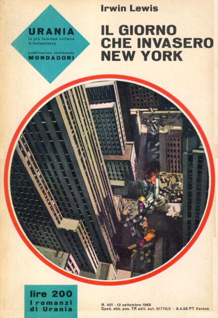
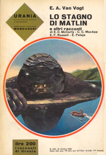
1500 SCI-FI covers. Urania sixties
1500 Covers of Urania, an Italian Sci Fi series ... incredible artwork and some really crazy images; monsters, semi nude women, it's all there.
Illustrator is Karel Thole. Yes a dutchman who moved to Milano in 1958. Graphic Designer, Cartoonist, Illustrator, dopehead?
I came across it googling for the illustrator of a sixties edition of Don Camillo which I found lying on a desk at my wife's parents.
Illustrator is Karel Thole. Yes a dutchman who moved to Milano in 1958. Graphic Designer, Cartoonist, Illustrator, dopehead?
I came across it googling for the illustrator of a sixties edition of Don Camillo which I found lying on a desk at my wife's parents.
11/14/2008


11/13/2008


GrainEdit
GrainEdit is a nice bloglike site with interviews with the best illustrators. They also have and even more interesting site on flickr where they keep and store the goodies. Hot Damn! Vault after vault is opened. Where does one find the time tom cherish all these delicacies?
tips and tricks for designers
This website, called Before and After contains a lot of tool tips, practical guidelines on essential design elements
9/25/2008
Bram Schouw commercial for Sensoor
Tonight I saw a good commercial (in dutch) on AT5 from director Bram Schouw for Sensoor. check it out.
9/09/2008
8/25/2008
Paul Sahre's dog's stick collection

I also found this on Paul Sahre's site. A collection of sticks from his dog which they started in 1994 .
Paul Sahre bookcover designs
I found out about this very good book-designer called Paul Sahre from New York. He designs mostly book covers but also makes pretty illustrations. He's amazing with both typography and imagery. All his covers are distinctie, very funny, original and they fit the content beautifully.
Paul, if you read this, I hope you don't me showing the ten people who read this blog your artwork. If you do, please let me know.


Paul, if you read this, I hope you don't me showing the ten people who read this blog your artwork. If you do, please let me know.
6/18/2008

Abonneren op:
Posts (Atom)
rss


Snap Shots
General Eclectic

General Eclectic