5/14/2008

fabulous poster designs

The Mountain Goats Noise Pop Concert Poster by Nate Duval

The Mountain Goats Noise Pop Concert Poster by Nate Duval

Explosions in the Sky LA Concert Poster by Nate Duval

Explosions in the Sky Concert Poster by Nate Duval
Damn, I missed out on the Explosions in the Sky concert last monday in the Paradiso. Such a shame


The Decemberists by Jason Munn (Liverpool)

the Decemberists by Jason munn of the Small Stakes

The Arcade Fire London Concert Poster (#1) by Burlesque Design


The Arcade Fire New York Concert Poster by Burlesque DesignThe Arcade Fire NYC Concert Poster by Burlesque DesignThe Arcade Fire CA Concert Poster by Burlesque Design


The Arcade Fire London Concert Poster (#1) by Burlesque Design

http://www.burlesquedesign.com/store/p_chromechildren.jpg

by Burlesque Design

Rage Against the Machine Oz Concert Poster by Ken Taylor

Rage Against the Machine Poster by Ken Taylor (a shame about the typography, such a dragging cliché those soviet letterings). The man can draw and design though


Snow Patrol, Hot Hot Heat Concert Poster by Daniel Danger

Snow Patrol, Hot Hot Heat Concert Poster by Daniel Danger


Decemberists by Jeff Kleinsmith

Hot Chocolate Art Print by Dan McCarthy
Hot Chocolate Art Print by Dan McCarthy. this guy is real find for me. I love his work. He;s obviously fascinated by contours and lines.


By the way, I took most of the images from posters and toys, where I got myself three posters! Can't wait!

why wasn't I told? film leaders

Submarinechannel: Supposedly this is one of the 100 websites you must have seen (before you die?), I mean this part of the site: All the great leaders, opening sequences and so on of movies. Subtitle: Forget the film, watch the titles.
A delight it is indeed.

Great Motion Graphics Design

This is a great intro for "300" by Garson Yu of yU+co (interview here).
Found this on Motiongrapher, a pretty and elaborate and very informative site about, you guessed it, motion graphics.
There I also found a clip of a commercial by 180 Amsterdam for HTC, the Iphone rip-off. Very nice.

5/05/2008

cool furniture

Guido Crepax furnituregiuseppe-canevese-crepax2.jpg
Guido Crepax furniture

This piece of furniture designed by Giuseppe Canevese features the artwork of graphic artist Guido Crepax (1933-2003), who was influential in the development of European comic art in the second half of the 20th century. His most famous storyline, featuring the character “Valentina“, was created in 1965.
(quote from here and here)
Creator of Erotic comic art, graphically brilliant.

5/04/2008

shepard fairey copycat

Shepard Fairey of Obey design made a poster for the Barack Obama campaign.

bs
The poster was for sale at the obama website, but is sold out ( print run of 5000). I noticed the prices are throught the roof on ebay. Originally sold for $70,- they now fetch at least 200 bucks. Now that's change we can believe in :)

It is a nice enough poster as far as the image is concerned. The iconic value is pretty dubious though, since the aestethics rely heavily on leftwing propaganda. As a poster said: "Good grief, where did this guy study -- the Joseph Stalin Art Institute? This stuff looks absolutely Soviet."
The cause is a worthy one though but the price is too steep for me.

Googling for poster info I came across this interesting article by Mark Vallen. The article points at the plagiarism that is very obvious in the work of Obey (Fairey).
The proof Vallen gives in his examples Vallen can't be denied. This is plagiarism (or nothing is). I am not that familiar with the work of Obey, though I have come across it many times (led zeppelin cover etc). I am not that big a fan (I have seen work like this that is better) , but the blatant stealing of iconic anti-establishment imagery makes obey fall from grace. Although stealing, reproducing, copying and lending is an old phenomenon in protest movements (see Che) I guess every generation gets the protest-imagery it deserves. The thing that bugs me most is that Obey is not a protest movement but a successful design agency (critcally acclaimed). In other words; I can't blame the guy in black, with the dirty ropey hair and the lousy dogs for not coming up with anything more original than using 80's squat lingo, but I can blame Fairey for deliberately stealing images of better and more original artists without giving them credit. Most of all I blame him for making dangerous art harmless by making it "nice looking".
The only credit I give him is that he made a poster for Obama. Though I am getting seriously suspicious about the retro look of the poster. I am sure we'll find out that was a rip-off as well in the future. It is obviously "inspired" by propaganda and the psychedelic sixties (see earlier posts about Griffin, Grimshaw and others), as is all of his work. Since all the images that can be seen here are oviously copied I guess the (style of) the Obama poster must be aswell. Seems the lot of the work just has the word "obey" pasted into it.


I like this image below graphically, but the title (the title is on the guitar) is stolen from the words on the guitar of my hero Woody Guthrie.


http://farm1.static.flickr.com/139/356822199_96979ebc09.jpg

5/03/2008

elegant flash design

this website uses flash in such an elegant manner. I know, that word elegant is old fashioned and it is not very fashionable to describe something that is amde recently. But it is the right word. I envy this design (and the knowledge of flash). I actually tore down the swf with a small app called flash decompiler, and it looks as gorgeous under the hood as the coachwork that carries it.

army man with cool new issuu gadget page viewer!!!

Following the also quite smart Picasa webalbum of the army man scans here is an even cooler thing. I absolutely LOVE Issuu. I have been searching for a page flip code souce for hours and hours (and found several) untill I found Issuu. It's free, it's gorgeous and smart and web 2.0 savvy (share, share, share). This is how to do it. Design smart web apps.
Expect to see me using this for the publication of some interactive sketchbooks (reason why I was searching).


5/02/2008

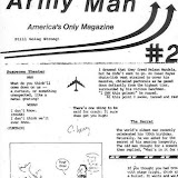
talking about magazines... Army Man scans


oh yeah...
Talking about magazines (and genius writers like Gossage). There is one serious hiatus in the "best of" list that I just have to mention here.
It is of course "Army Man - America's Only Magazine" (even the title and subtitle are thè best ever).
This must be the funniest magazine ever. I found out about this magazine when the believer (the number 2 on my list, naah #1) issued a facsimile of the much sought after #1 issue.
Editor George Meyer (read a brilliant profile from...again a favourite magazine, the New Yorker here) is called the funniest man on eart and I believe there is a lot of truth to that claim.

Because I am such a generous man I will post scans of Army man's pages here. I came across them years ago and have treasured them on my harddisk (I moved them with each new one). Thanks for the guy that did the scanning then, unfortunately I do not know a a name or a link. Too bad the pics aren't bigger (the old days?). What I did was print them and try to read them and memorize them.
Do as I did and give this as a gift to yourself and your offspring.
Favourite? Ask Uncle Trivia.

army man scans


5/01/2008

Send me yr goddamn manuscripts. Cut me in on yr freak-beams. I'll print anything.

http://realitystudio.org/images/bibliographic_bunker/fuck_you/fuck_you.01.jpg


http://realitystudio.org/images/bibliographic_bunker/fuck_you/fuck_you.03.jpg

Also on the list in the list mentioned in the previous post "fuck you / a magazine of the arts.
Here's the blahblah (the picture above tells it all me thinks)

Fuck You/ a magazine of the arts

Fuck You/ A Magazine of the Arts. (1962-1965). Thirteen issues, considered one of the most influential underground magazine of the early Sixties. Started by Ed Sanders--Beat poet, Fugs band member, and proprietor of the underground Peace Eye Bookshop--Fuck You was a deliberately provocative mimeographed journal, at first emphasizing poetry and later expanding to include other writing. Each issue is illustrated with line drawings by Sanders.

Contributors included Sanders, Tuli Kupferberg (also of the Fugs), Carol Bergé, John Wieners, Andy Warhol, Ray Bremser, Lenore Kandel, Charles Olson, Joel Oppenheimer, Peter Orlovsky, Philip Whalen, Allen Ginsberg, Herbert Huncke, Julian Beck, Frank O'Hara, Leroi Jones, Diane DiPrima, William Burroughs, Gary Snyder, Robert Kelly, Judith Malina, Carl Solomon, Gregory Corso, Robert Duncan, Robert Creeley, Michael McClure, Ted Berrigan, Joe Brainard, Gilbert Sorrentino, and many others--a virtual "who's who" of avant garde poetry in the Sixties.

I wish I could get my hands on a copy of this. I love underground magazines and especially ones where the editor note says: "Send me yr goddamn manuscripts. Cut me in on yr freak-beams. I'll print anything."

There is a vol 1 issue 2 listed on abebooks for the slight amount of $1400,- How counterculture babyboomers devour their own children.


the best magazines ever

The 51 Best* Magazines Ever

Best of lists are always a highly dubious claim, but they make for an interesting read. This article lists the 50 best (*Smartest, Prettiest, Coolest, Funniest, Most Influential, Most Necessary, Most Important, Most Essential, etc.) magazines of "all times" and at least some of my favourite magazines are on the list (and period correct).

Howard Gossage

this is a site dedicated to the life and works of advertising genius Howard Gossage (1917-1969) The socrates of San Fransisco.
He did some truly brilliant, disruptive and highly onconventional ads. The guy's a true legend and inspiration.
Here's an article on how he is still relevant, to online advertising (indeed, indeed, strange times).
be sure to read the copy below. It is of the highest quality; monty python would be proud (though I realize prosumers don't read anymore.)

Among the many quotes that are worth being cut in stone and driven through the big glass facades of ad agencies are his : "Advertising: A multibillion dollar hammer pounding a ten cent thumbtack." and "You don't have to bruise an elephant all over to kill him. One shot in the right place will do."
He also had some refreshing approaches to the "consumer" and target audiences:
"I don't know how to speak to everybody, only to somebody." and:
"To ask consumers how they like ads is like asking a galley slave what he thinks of his job calisthenics-wise."


http://www.lacreativeclub.com/images/mottoad.jpg
This is an ad for Fina.http://www.lacreativeclub.com/images/shirtkerad.jpg
and one for eagle shirtmakers.

http://www.adbuzz.com/OLD/GossageGallery/Qantas1.jpg
and quantas.


thanks to addbuzz and ciadvertising
I did not mean to steal officer, just to borrow..

CIA handbook on overthrowing the Nicaraguan government

the mirror world of the worldwide web sure is a strange place. the "original" image, the real world, is (obviously) even weirder (since it has ubstance instead of pixels).
On Flickr I found scanned in pages of a CIA manual to overthrow a government (apparantly the Nicaraguan Sandinista government in this case). It is a fascinating studies in civil disobedience. One should come late to work (or call in sick), hide and damage tools, spread rumours, make false hotel reservations, threaten the boss by telephone, disable cars ,make molotov cocktails.
There are also more clumsy tips (it he above weren't clumsy enough); spill liquids on documents, cut and perforate the upholstery of vehicles (what the hell for? you already put dirt in the gastank on page 9).
My favourite is; "plant flowers on State Farms" pure poetry.

For those among you (whoever the hell that is :)) who are looking for tips and tricks to overthrow a government (americans among you?) without making your hands dirty, here are the things you always wanted to know about CIA methods but were afraid to imagine.
As funny as this is, it makes you wonder what the hell those people in the pentagon think they're doing. Now and again...
Whoooo if al quaida were to come across this manual. I have often wondered what it would be like if terrorism was exterted in a more daily, less spectacular mode. It would certainly scare the shit out of me.
Then again, they don't scare me nearly as bad as the guys at work in the agency.
as Hunter 'd say "it never got weird enough for me".
If the book is real that is.


Paris, may 1968, poster gallery

Retour à la normale...

Here is a small gallery of posters that were made in 1968 during the french student protests. Here is another, and another. Some of these posters still look vital although most have become iconic (and thus a bit "safe" because of their vernacular hipness and worth). A style had been set though and a lot of current protest art can at least learn something from the clean and "sec" language, both textually and visually.

Wheatpasting the posters on the street